Martha stewart Living 
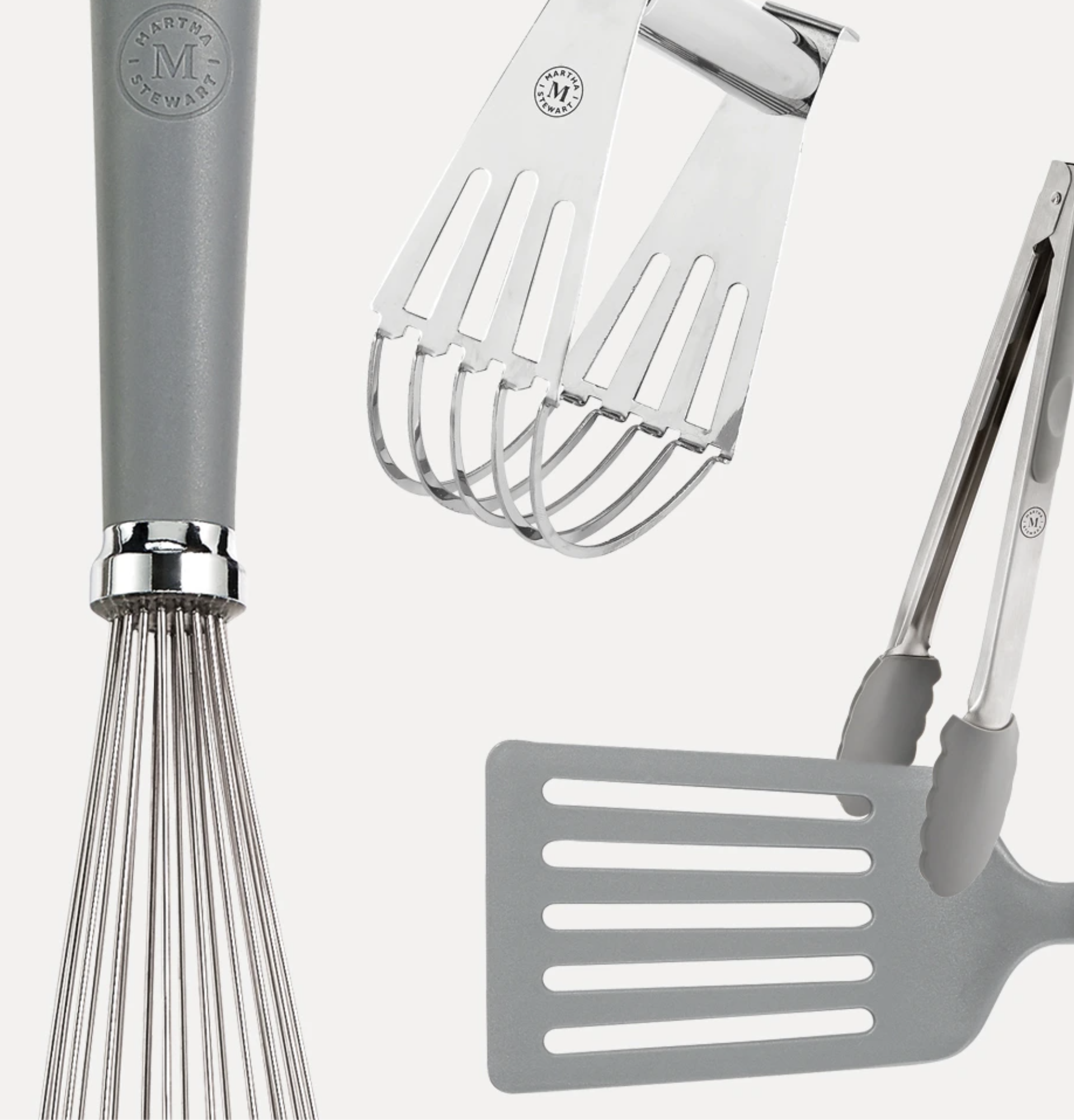
Close-up of a kitchen faucet, a metal dish drying rack with slotted design, and a grater, all in a modern kitchen setting.

Martha Stewart's multi-brand empire has been built over the years through a series of individual partnerships, each represented by its own logo or emblem to reflect the beauty and value behind the collaboration. However, the unique branding across partnerships had fragmented the brand identity, diluting the brand's overall cohesion.

Our goal for the rebrand was to unify the brand under one distinct logo and emblem—differentiating each business only by changing the name beneath the emblem. This shift transformed Martha Stewart from a house of partnerships into a more cohesive, branded house.
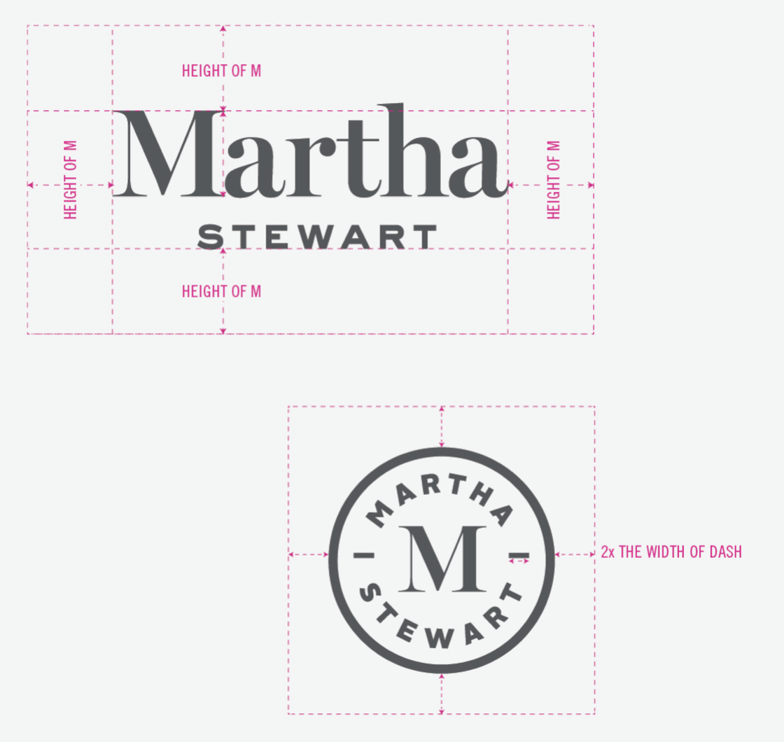
Two logo designs for Martha Stewart. The top logo features her full name in large, bold letters with the first name 'Martha' prominently displayed and the last name 'Stewart' beneath it. The bottom logo is circular with her name around the top and bottom edges, and a large letter 'M' in the center. Pink measurement guides indicate spacing and proportions for logo design.

2017
Creative Director: Soyoung Oh, Jeff Pidgeon
Art Director/ Design: Catherine Lee, Demi Ngai
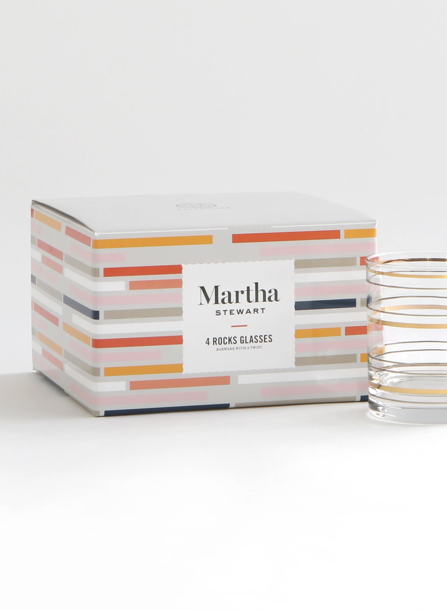
A box of Martha Stewart 4 rocks glasses with colorful striped design, placed on a white surface next to two transparent glasses with gold rims.
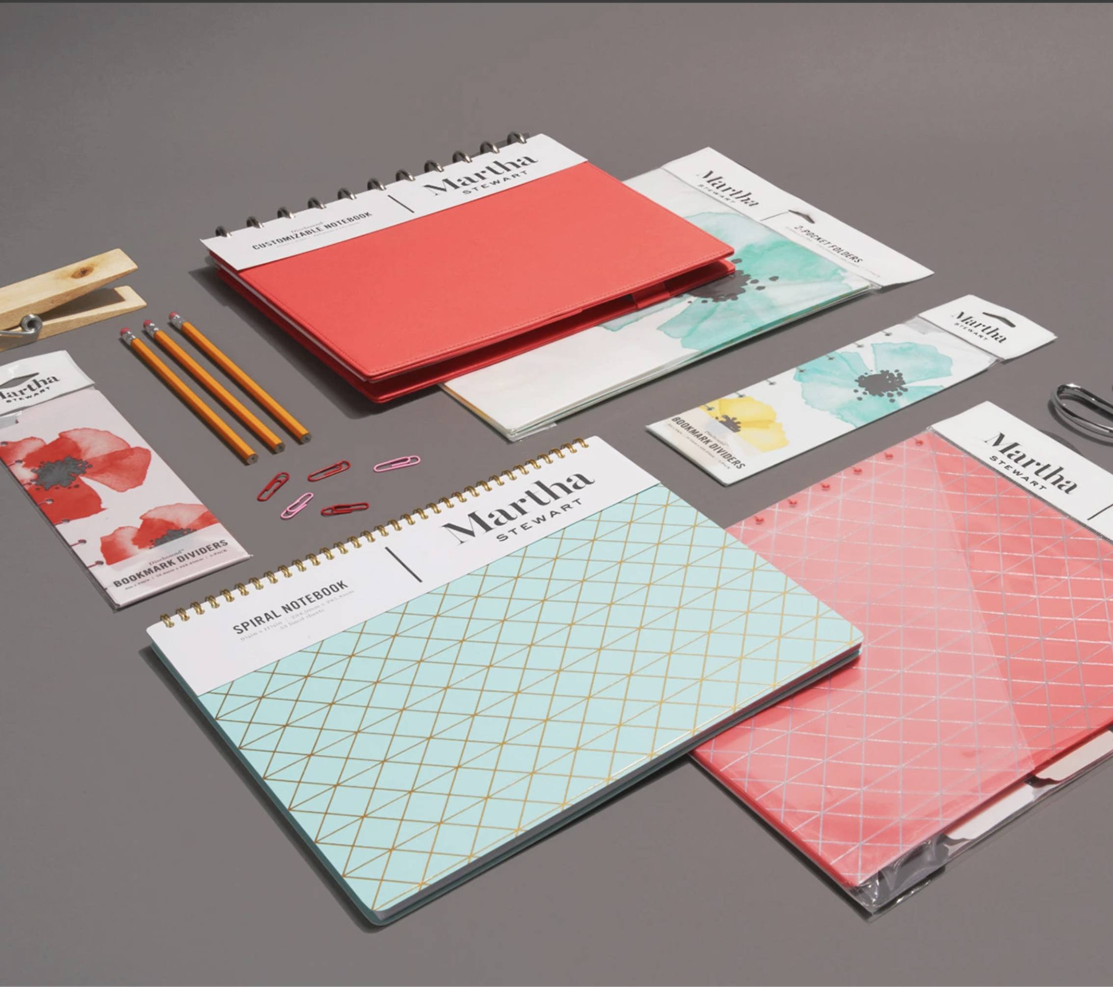
A gray table displays organization and office supplies, including a red binder, a spiral notebook with a geometric pattern cover, and various bookmarks and paper clips. The items are neatly arranged for planning or creative work.
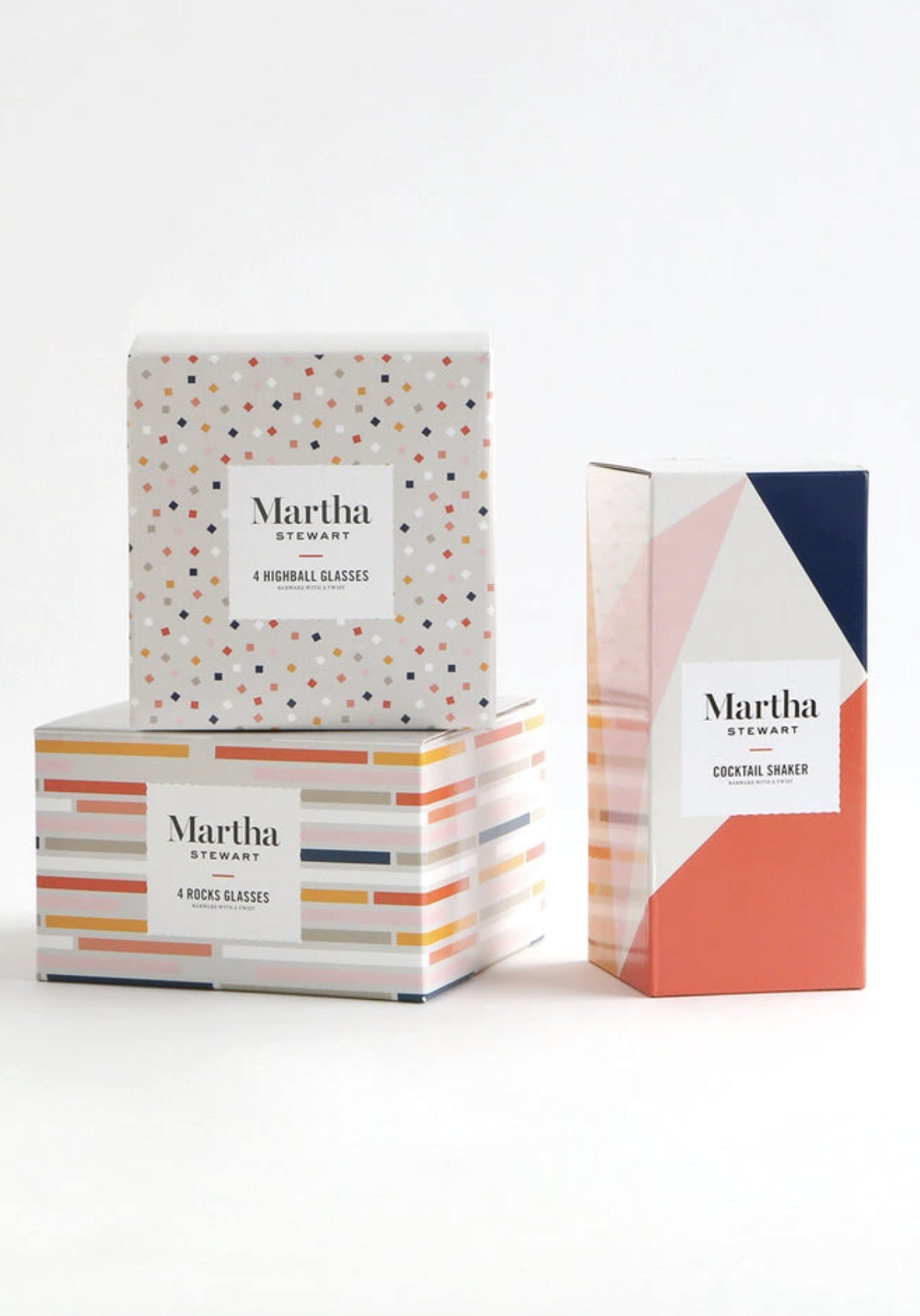
Three colorful boxes of Martha Stewart glassware, including highball glasses, rocks glasses, and a cocktail shaker, arranged on a white surface against a plain white background.